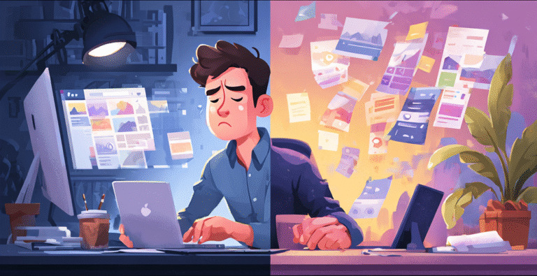
⏱ You Only Have 7 Seconds — Here’s Why It Matters
Most visitors decide whether to stay on your website in the first seven seconds. This is the moment when the brain forms a snap judgment: Does this site look trustworthy? Is this for me? Should I keep scrolling? If your design fails to communicate clarity and confidence instantly, users leave — even if the rest of your site is actually great.
This is why the above-the-fold section is the most valuable real estate in web design. It’s your digital “first handshake.”
🎯 The 3 Questions Your Above-the-Fold MUST Answer
If your hero section doesn’t answer these three questions immediately, your bounce rate will climb:
- What is this?
Your headline should explain exactly what you do — in plain English. - Why should I care?
A short subheadline helps users understand the benefit or transformation you offer. - What do I do next?
A clear CTA guides them toward the next step instead of making them guess.
If any of these are missing, people feel lost, and lost users leave.
🔥 The Most Common First-Screen Mistakes
New or rushed websites usually fall into these traps:
- Cluttered hero image that distracts from the message
- Weak headline that tries to be “creative” instead of clear
- CTAs hidden or duplicated
- Busy backgrounds overpowering text
- Too many menu options
- Hard-to-read fonts
- Slow-loading animations or videos
These mistakes don’t just “look bad” — they create cognitive friction, which kills conversions.
🧭 A Simple Formula That Works Every Time
Here’s the structure I always use when designing high-converting hero sections:
- Bold headline with a single message
- Short subheadline that clarifies value
- Primary CTA that stands out visually
- 1 clean visual (product photo, mockup, or illustration)
- Generous spacing for a breathable layout
- High contrast for easy readability
This combination works because it removes confusion and creates instant trust.
Clean Hero Layout Example
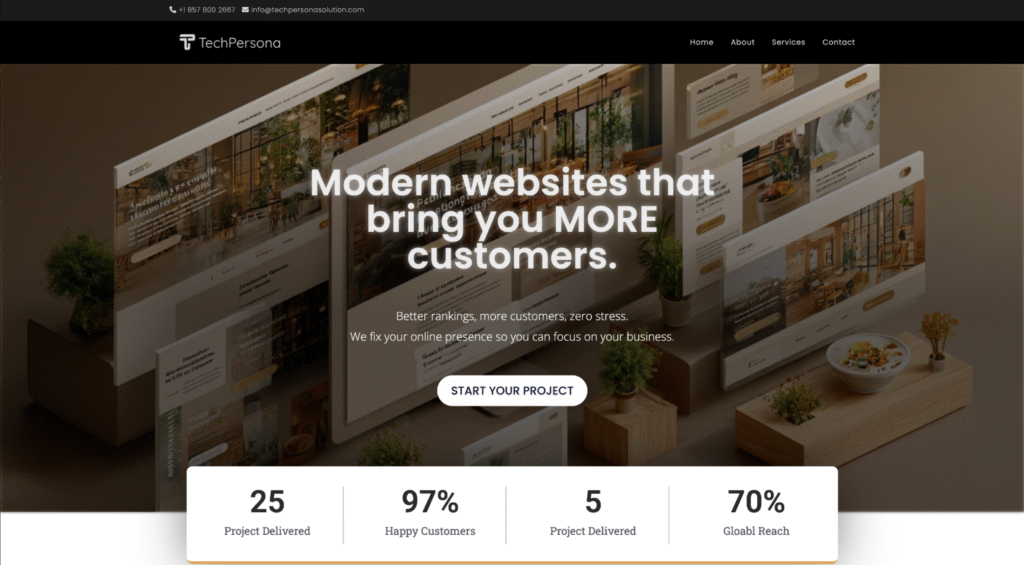
- Left: Headline + Subheadline + CTA
- Right: Product image
- Bottom: Trust badges or social proof
🏁 Final Insight
Your homepage doesn’t need to impress everyone — it needs to guide the right people quickly.
Design your first screen with purpose, and you’ll keep users long enough to tell your story.