Every Beginner Makes These Mistakes — You Don’t Have To
When you’re new to web design, it’s easy to obsess over fonts, colors, or animations while ignoring fundamentals. The good news? Most beginner issues come from just a few predictable habits — and once you fix them, your work starts looking instantly more professional.
Below are the top mistakes I see constantly, plus the fastest fix for each.
🔥 The 10 Most Common Beginner Mistakes
1. Using too many fonts
More fonts = chaos.
Fix: Use two fonts max — one for headings, one for body text.
2. Random color combinations
Design falls apart when colors don’t feel intentional.
Fix: Choose a 3-color palette: primary, secondary, accent.
3. Inconsistent spacing
Uneven padding makes a site feel messy even if the content is good.
Fix: Use spacing scales like 4 / 8 / 16 / 32.
4. Low-quality or stretched images
Images set the tone of your brand instantly.
Fix: Use high-resolution assets and maintain aspect ratios.
5. No visual hierarchy
If everything looks equally important, nothing feels important.
Fix: Change size, weight, and contrast to guide the eye.
6. Overcrowded hero sections
Too much info at the top creates overwhelm.
Fix: One message + one image + one clear CTA.
7. Ignoring mobile design
Desktop-only mindset is outdated.
Fix: Think mobile-first or design both simultaneously.
8. Misaligned elements
Misalignment looks amateur fast.
Fix: Stick to left-align, center-align, or grid-based alignment.
9. Heavy shadows and gradients
Beginners often “decorate” instead of design.
Fix: Use subtle shadows and minimal gradients.
10. No component consistency
Buttons, cards, headings — they can’t look different on each page.
Fix: Build a simple style system early.
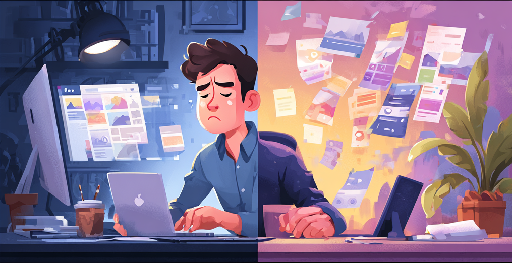
[insert image] Before vs After Design Structure
- Before: random spacing, mismatched fonts, cluttered sections
- After: clean grid, consistent styles, balanced spacing
🚀 Final Advice
Great design is not about doing more — it’s about removing everything that weakens clarity.
If new designers focused on spacing, hierarchy, and consistency first, their work would improve dramatically overnight.